We know that podcast artwork is important, but what does it take to design a successful image for your show? You want listeners to take you seriously, so you need something professional-looking and attractive to represent your podcast. But what are some best practices for designing artwork?
Christine Lieu is a branding specialist. She and her team have helped numerous companies create a cohesive branding, website design, social media content, and podcasts to increase their impact. Recently Christine taught the Podcast Movement community about how to create compelling podcast artwork.
Christine addressed the importance of podcast artwork, how to set it up correctly, various tools that help with design elements, what to do with your artwork, and what to avoid in her presentation.
The Importance of Podcast Artwork
Podcasts are visual mediums as well, and you should create high-quality visuals that reflect the look and feel of your show to engage listeners.
The first thing to consider is that podcast directories will not allow you to submit your podcast unless you have artwork. Podcast artwork is a requirement for your show to be allowed in Apple Podcasts, Spotify, Google Podcasts, Pandora, etc.
Secondly, your podcast artwork helps your show to stand out from other competing shows in specific categories. A great podcast cover art image is essential as you're scrolling through a podcasting app on your phone. It will help you get noticed, especially if one of your launch goals is to appear in Apple Podcast's New and Noteworthy section.
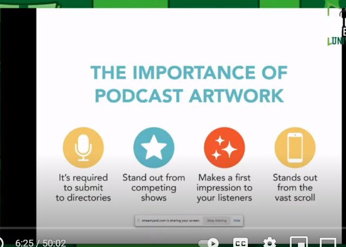
The third thing to consider regarding your podcast artwork is that it makes an important first impression on your listeners. Your prospective audience is scrolling through a podcast app on their mobile device or laptop, possibly looking for a new show. You want to grab their attention.
If your artwork is not memorable, they may keep scrolling and not come back to it. It does help as your audience sees more of your artwork on social media. Your listeners begin to build familiarity and trust with you. Great artwork helps you as you're growing your listenership and engagement, and subscribers.
The fourth reason for compelling artwork is to stand out. It's undeniable that the number of podcasts continues to grow. Keeping your show and artwork quality in check and making sure that it stands out from other podcast artwork will help you continue to level up your show.
Podcast Cover Art Setup
The primary podcasting directories will not accept your podcast artwork unless it meets specific requirements. The image must be a minimum size of 1400 pixels by 1400 pixels which is a square.
The artwork should not be larger than 3000 pixels by 3000 pixels. The size specifications also allow your artwork image to be ideal for use on Instagram and other places online where you want to promote your podcast.
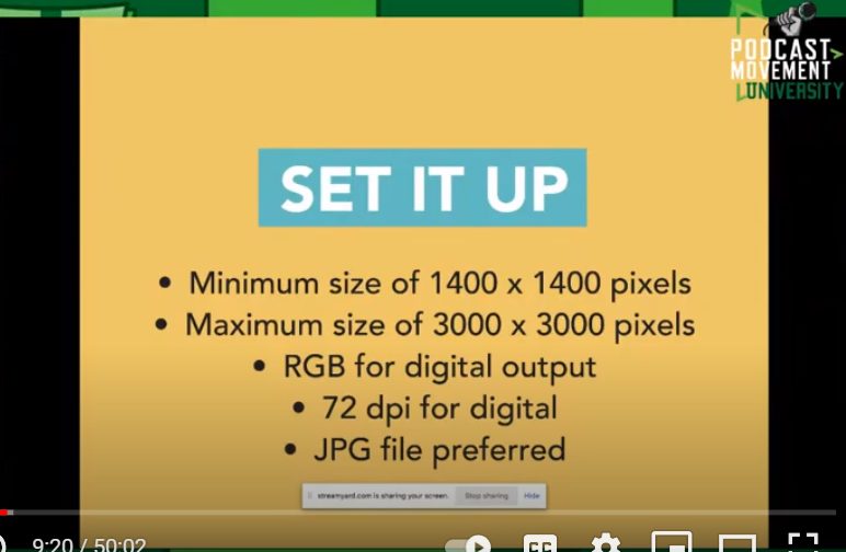
Ensure that your artwork is at least 72 DPI, if not higher so that the image is nice, clean, and crisp. Use RGB for the color code of your artwork since it is digital.
Your image should be a JPG or PNG, which are the most commonly used image files and help compress your image's size. These factors will prevent your podcast cover art from appearing blurry or distorted in podcasting apps on mobile devices.
Tools
A lot of designers use Adobe Creative Suite. If you are not already familiar with their options, you would likely want to consider hiring a graphic designer through sites like Upwork and Fiverr.
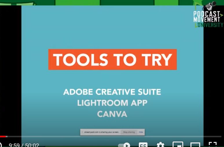
Podcast artwork is easier to create on your own with tools such as Canva and BeFunky. Here is a video on Youtube that walks you through the basics of creating your podcast cover art with Canva.
If you are not well-versed in graphic design, invest in an outside designer to help with your artwork.
Podcast Artwork Do's
- Communicate Clearly – Make sure that your artwork is clear and stands out. You want prospective listeners to understand what your show is about instantly.
- Define Your Audience – Understand what interests your audience. What is their demographic? Your podcast distributor/hosting company provides you with analytics and statistics. Your podcast stats are a great place to reflect and review, to help make decisions when considering whether or not to update your podcast artwork.
For example: if you have a female-identified audience, maybe they'll resonate with certain styles or colors more than a different type of audience. Style and colors are something to keep in mind, especially in age demographics. If your target audience gravitates toward a specific look or colors, you want to consider applying that to your future podcast artwork modifications.
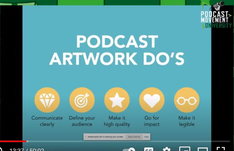
- Make Your Image High Quality – Go for impact! You want to verify that your artwork is not blurry when viewed from a mobile device. Your image represents you and what you're about, so by keeping it high quality, you can share it on social media channels too!
- Make Your Artwork Legible – Make sure the text on your artwork is legible, scales, and grabs people's attention, mainly because it is small on mobile devices. Maybe your text is “too busy” or has too much going on. Keep it clear and easy to read. Do not use more than five words on your artwork, including your name.
Podcast Artwork Dont's
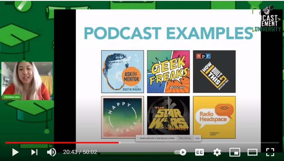
- Not Showing Your Personality – A big don't is to forget your personality in podcast artwork. Your cover art must have a lot of punch, like the Geek Freaks podcast example. Their artwork does much more than show their personality – it showcases who they are and what they offer to an audience that understands why this is important and appealing.
- Overused Imagery – Avoid overused imagery such as microphones, headphones, etc. Typically in the podcast space, you can think outside of the box and get creative. If you have different ways to represent the topics discussed during your show, your podcast image is a great way that you can include those elements.
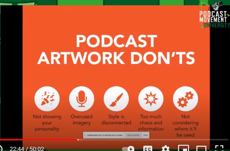
- Style is Disconnected – How can your artwork help you connect with your audience further? Your artwork helps impact how they trust you and then inevitably subscribe, leave a review or engage with you through other channels such as Facebook.
- Too Much Chaos and Information – Less is more! You want to make it as easy as possible for listeners to understand what your show's about and who you are. Know that a clean design with one or two colors in the image will help best represent your podcast.
Not Considering Where It'll Be Used – Where will your artwork be visible beyond the podcast directories? Your artwork will likely appear on your website, possibly in a digital banner, business cards, postcards, guest artwork for episodes with interviews, etc.
In conclusion, your podcast artwork is an integral part of crafting your brand and standing out in a saturated podcast market. Your cover art respects your listeners by not overcomplicating things with too much information or chaos. Your image gives a first impression of who you are and why listeners need to check out your podcast. Make your artwork count!
Here is the video from Christine Lieu’s presentation.
Additional Resources
How to Create Stunning Podcast Artwork by Buzzsprout

Join the Movement