
![]() Hey, Wil, have you noticed an uptick in people talking about podcast websites recently? Just me? Is this just Baader-Meinhof whatever again?
Hey, Wil, have you noticed an uptick in people talking about podcast websites recently? Just me? Is this just Baader-Meinhof whatever again?
![]() I have and it’s my favorite! Who’s Baader-Meinhof? Wait, I have Google. Oh, right, the “I just heard this word for the first time and now I’m hearing it everywhere” thing. There’s a chance that’s the case here, but I hope that instead, people are actually just starting to take their podcast websites seriously!
I have and it’s my favorite! Who’s Baader-Meinhof? Wait, I have Google. Oh, right, the “I just heard this word for the first time and now I’m hearing it everywhere” thing. There’s a chance that’s the case here, but I hope that instead, people are actually just starting to take their podcast websites seriously!
Maybe this is because of the popularity of built-in podcast websites on platforms like Libsyn, or the new “podsites” on Radio Public. Either way, I’m just glad people remember that it is the year of our lord 2019 and that you need a website.
We’ve already talked a little bit about websites, but I think our readers have graduated. Ely, are you ready to take them from 101 to 201?
![]() Born ready! Welcome to website design and accessibility part two, class. You can catch up to us by reading part one over here, where we talk about why you need a website for your podcast and some of the basics of design.
Born ready! Welcome to website design and accessibility part two, class. You can catch up to us by reading part one over here, where we talk about why you need a website for your podcast and some of the basics of design.
One of the first things you will have to consider when planning a website is, of course, where you’re putting it. Wil and I have made this neat price comparison table for some of the more popular hosts and builders, including which ones have free options. It bears repeating from part one: a free website is better than no website.
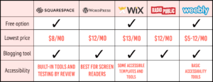
![]() It’s true. Nobody is going to care if your website is “[podcastname].wordpress.com.” And if they do, that’s classist and weird, and you should ignore them. Good people aren’t going to care. I know Squarespace is the big famous love of podcasts–and now Wix, to some extent–but I’ve always used WordPress, and I love it.
It’s true. Nobody is going to care if your website is “[podcastname].wordpress.com.” And if they do, that’s classist and weird, and you should ignore them. Good people aren’t going to care. I know Squarespace is the big famous love of podcasts–and now Wix, to some extent–but I’ve always used WordPress, and I love it.
I love that it’s ready-made to be accessible for screen readers, for instance, whereas some other platforms aren’t. This isn’t sponcon; instead, it’s a reminder to look into the built-in accessibility features on whatever platform you choose. That way, you’ll be able to rest easy knowing it works without you having to keep it in mind as you build your site.
![]() Transcripts are not the be-all end-all of accessibility for podcasts. Website accessibility is often left by the wayside and can sometimes be hard to figure out. If this is your first time specifically considering accessibility features, I highly recommend using a checklist like the first basic one provided by the W3C Web Accessibility Initiative and following the basic principles listed here by WebAIM. Here are some tips on where you can start:
Transcripts are not the be-all end-all of accessibility for podcasts. Website accessibility is often left by the wayside and can sometimes be hard to figure out. If this is your first time specifically considering accessibility features, I highly recommend using a checklist like the first basic one provided by the W3C Web Accessibility Initiative and following the basic principles listed here by WebAIM. Here are some tips on where you can start:
- investigate which theme templates provided by your builder are screen-reader accessible
- turn on accessibility tools provided by your builder (e.g., on Wix, you have to activate Keyboard Accessibility and Visual Indicators)
- provide alt text for images that convey meaning or information
- think about font choices and how they affect dyslexia
- provide HTML options for non-HTML content (such as PDF transcripts or PowerPoint slide decks), or ensure that the non-HTML content is accessible
![]() Always remember that not everyone interacts with things like websites the same way that you do. Never assume that only sighted people are checking your website. And while we’re there, let’s talk about other audiences your website might be excluding–like people who don’t know how to access a podcast. Does your website give instructions on how to listen to your podcast, or how to subscribe? You might want to think about adding a section on how to listen — including a specific “How to Listen” tab on your site’s main menu or header.
Always remember that not everyone interacts with things like websites the same way that you do. Never assume that only sighted people are checking your website. And while we’re there, let’s talk about other audiences your website might be excluding–like people who don’t know how to access a podcast. Does your website give instructions on how to listen to your podcast, or how to subscribe? You might want to think about adding a section on how to listen — including a specific “How to Listen” tab on your site’s main menu or header.
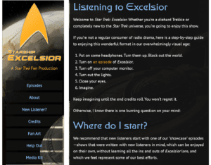
Ely, what are your thoughts on top menus on podcast websites? I’m a big fan of having a clear ‘Home' page that gives a synopsis and maybe an embedded episode, a ‘How to Listen' page, a ‘Cast and Crew' page, an ‘Episodes and Transcript' page, and a ‘Support' page. I love more than that, but I think those are what I’d consider the basics.
![]() Big agree on all those points! Your support page should include all the descriptions of where people can give you money, so that includes links to your Patreon, your ko-fi, your PayPal, and whatever else you use for your podcast.
Big agree on all those points! Your support page should include all the descriptions of where people can give you money, so that includes links to your Patreon, your ko-fi, your PayPal, and whatever else you use for your podcast.
I’d also suggest having a ‘Press' page right up top. This is where you can put press releases and your press kit, as well as the best contact information for a member of the press to use to reach out to you. For instance, check out the support page and the press page for Alba Salix!
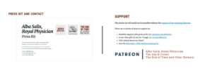
![]() Hey Ely, I think we might know how they can go about talking to the press, too. With being contacted, I’m also a big fan of a contact page, even if it’s just links to your social media accounts.
Hey Ely, I think we might know how they can go about talking to the press, too. With being contacted, I’m also a big fan of a contact page, even if it’s just links to your social media accounts.
Some bonuses I like on a podcast website are social media feeds, any bonus content, pictures of the cast and crew — I also love blog posts that accompany episodes, especially for nonfiction podcasts. I know podcasts already take so much time and energy, but I love written content that pairs well with an audio episode. It’s like a nice little content dessert!

![]() We mentioned in part one that having your audio on your website is crucial for discovery, and it bears repeating. Under ‘Episodes and Transcripts' have your episodes playable right from your website, and keep a link to a transcript or captioned videos near each episode. That way your visitors won’t get lost.
We mentioned in part one that having your audio on your website is crucial for discovery, and it bears repeating. Under ‘Episodes and Transcripts' have your episodes playable right from your website, and keep a link to a transcript or captioned videos near each episode. That way your visitors won’t get lost.
![]() I love how The Whisperforge’s podcasts, like The Far Meridian, do this.
I love how The Whisperforge’s podcasts, like The Far Meridian, do this.
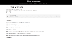
![]() The Whisperforge folks are always so on point with their website design. Remember that your choices for your website are what will enable people to discover your podcast, listen to and support your podcast, and talk about you to their friends! Think about how you want to widen that net, make your podcast and podcast-related things accessible, and keep creating.
The Whisperforge folks are always so on point with their website design. Remember that your choices for your website are what will enable people to discover your podcast, listen to and support your podcast, and talk about you to their friends! Think about how you want to widen that net, make your podcast and podcast-related things accessible, and keep creating.

Join the Movement